Below are packaging design concepts created for YRBA, a natural Yerba Mate Energy drink company. https://www.drinkyrba.comYRBA Design Concepts
/ LOGO
In the process of designing these logos, there were significant challenges related to subtle variations that influenced their reception. Some iterations incorporate a tagline, while others omit it, underscoring the careful balance required to achieve a visually compelling result. Other variations include embossment, gradients, and varying line weights.
DIELINES \


STICK PACKS \
Central to these designs is the need for clear flavor differentiation within a cohesive layout across all packets. Presented below are examples showcasing the Orange and Blackberry flavors./ CHOICES
The use of the explosive powder burst in these designs are used to signify the burst of energy the customer will receive from using the product. These designs convey a sense of energy.This designed to evoke the solubility of the YRBA powder, as the logo fades into a gradient- much like the YRBA powder in water. YRBA offers a smoother hydration and caffeination experience compared to other brands.The liquified type on these packages are also used to evoke a sense of energy and motion, aimed to mirror what the effect of YRBA. The juice imagery also denotes an energized and refreshing experience.BOX VARIATIONS \
The goal for the early designs of the front of the box was to convey a sporty and athletic look, so that people perceive the product as beneficial to their health, and something that could be worked into their health routine.There is also an emphasis on the white space, to maintain a clean uncluttered look, easily conveying important product information.


/ front designs


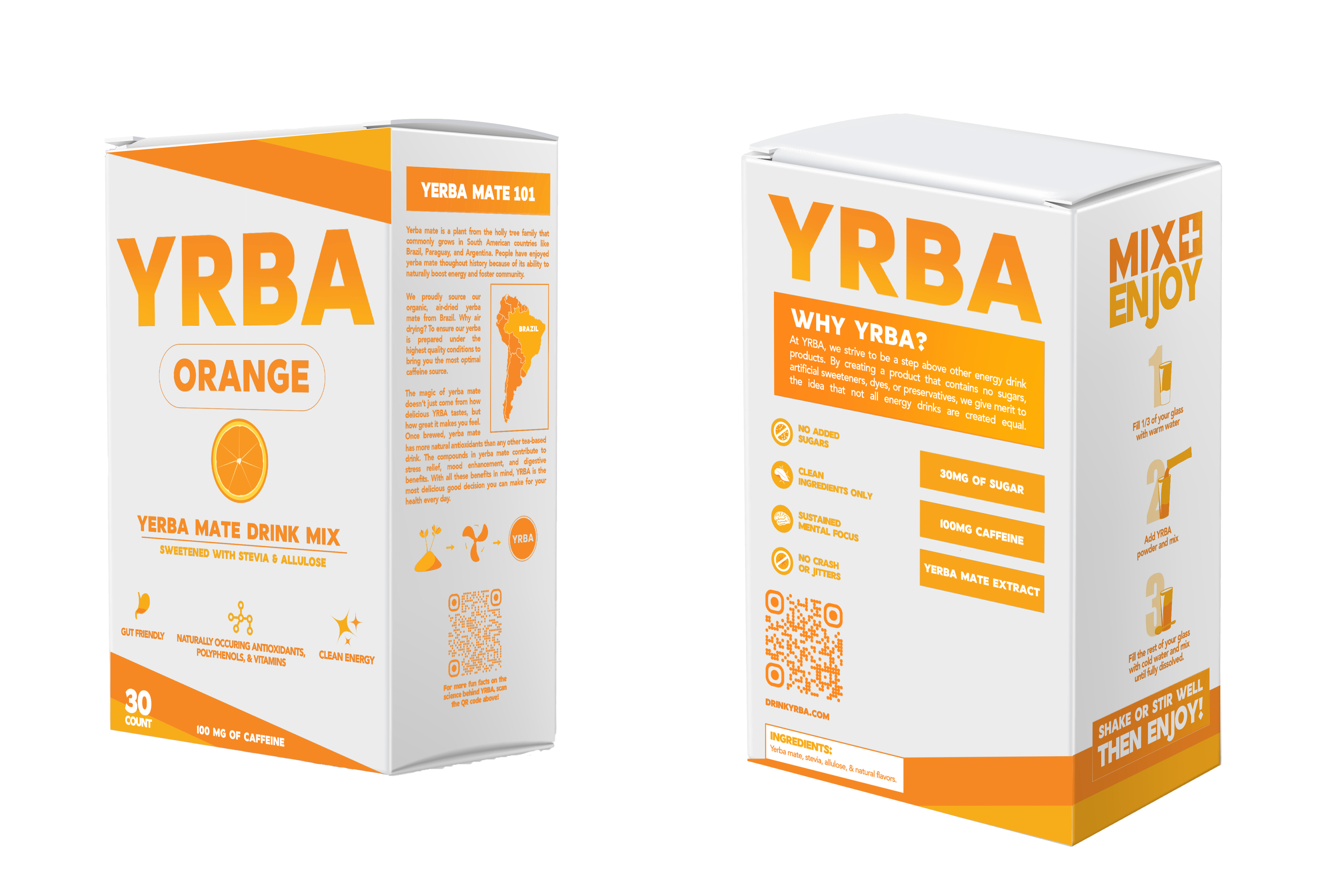
SIDES \
side 2 \
Orange Flavor
/ side 1
Blackberry Flavor
Final side designs for all flavors
the most important part of these designs was to create icons consistent with the existing ones on the other parts of the box, including creating them to be versatile in color-way to better match with each flavor's main colors. There were also ongoing tweaks to side 1 due to the language being changed in the directions. A big focus for side 2 was to leave space for a QR code, so that the information on the box is easily supplemented by everything else that can be found on the website. The icons convey the simplicity and naturalness of the product, further emphasizing the text above.